
- Casey Storey
- Aug 19, 2025
- 4 min read
You can have the world’s best chips—made with love, tradition, and a secret family recipe—and still get passed over in aisle five.
That was the case for Downriver Chip Co.
They’d been in business for 20 years. Their chips were delicious—made with their grandmother's tortilla recipe that had been passed down for generations. Locals knew them, loved them, and looked for them in neighborhood mom and pop shops. But when it came to landing bigger retailers?
“Your chips taste amazing… but come back when your branding is more developed.”
Their product was ready for the spotlight— but their brand kept them stuck in the shadows.
A GREAT PRODUCT ISN'T ENOUGH
Many brands—both emerging and established—fall into the trap of thinking the product will speak for itself, or that slapping on a logo equals “branding.” Or, sometimes they even keep refreshing the packaging or website, hoping the fifth update will finally get them the attention they deserve. I get it. These are the obvious places to start—the things you can see and touch.
But when you step into a bigger arena—regional grocers, national buyers, and online shelves packed with competition—it’s not just about having a quality product or having a cool logo anymore.
It’s about building a retail ready brand that feels just right—to the buyer, the shopper, and even to you.
And to do that, you start with the less visible parts of your brand: positioning, personality, and audience.
That work gives you clarity.
That’s the first ingredient in the Bold Brand Formula™:
Clarity + Character + Consistency = Major Shelf Appeal
Let’s talk about what clarity actually means—and why it’s so easy to get wrong.
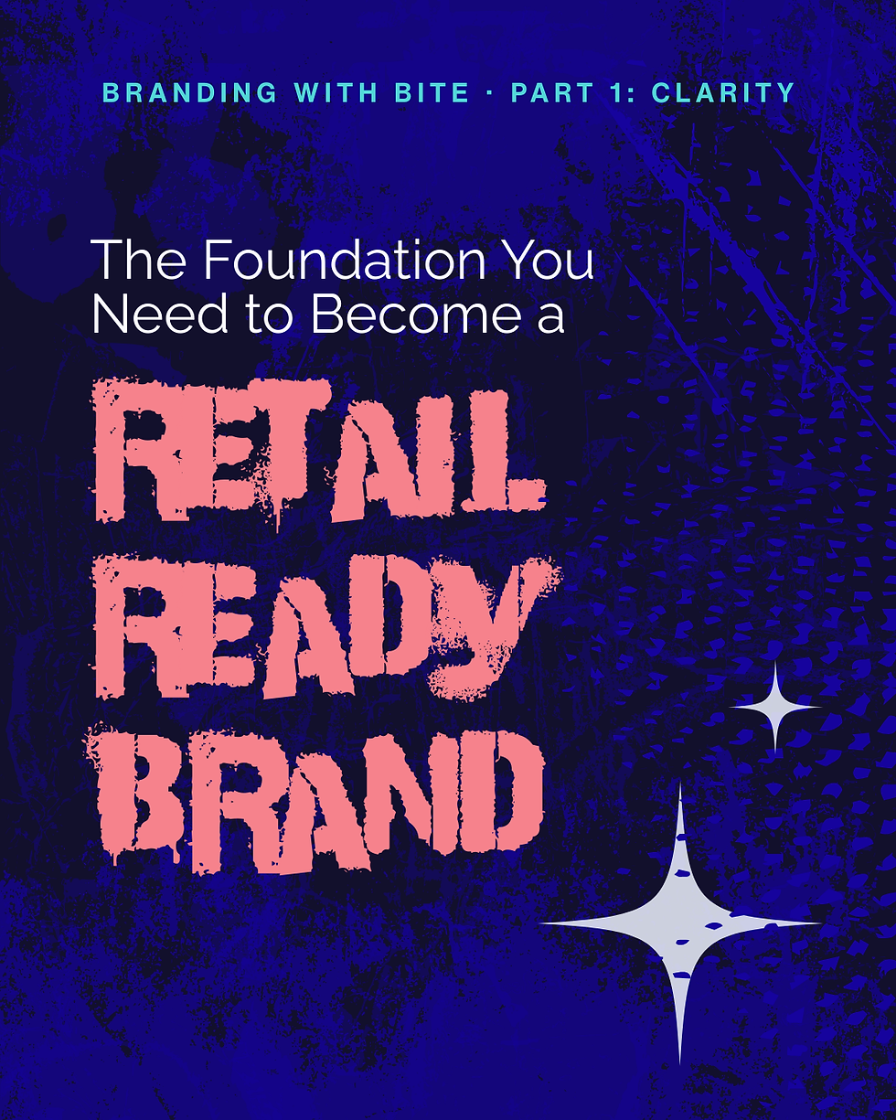
WHAT CLARITY LOOKS LIKE IN A RETAIL READY BRAND
Clarity is the foundation. It’s what makes a customer pick up your product or a retail buyer excited to carry you in their stores.
It consists of three parts: Positioning (where you stand), Personality (who you are), and Audience (who you’re for). When those are solid, how you look and sound stop feeling like guesswork.
✅ POSITIONING
Positioning is the corner of the category you claim and the promise people remember. It answers, “Why you over the brand next to you?”
For Downriver Chip Co, that meant owning bold, home-grown flavor rooted in family tradition. Not just "tasty chips,” but a cool local favorite you’re proud to show up with. That’s a clear promise buyers can clock in one glance and keeps them coming back for more.
✅ PERSONALITY
Yes, your brand has a personality. It’s the vibe, the attitude, the way you make people feel.
To give this shape, I use brand archetypes.. There are twelve classic patterns: The Innocent, The Everyman, The Hero, The Rebel, The Explorer, The Creator, The Ruler, The Magician, The Lover, The Caregiver, The Jester, and The Sage. Think of them like your brand’s zodiac.. It's a quick way to set the vibe, guide decisions, and create a frame of reference you can always come back to. You can blend them.. but they should feel like one real person.
For example, Downriver Chip Co. is a fusion of The Rebel and The Everyman.. a friendly renegade if you will. They’re the neighbor who throws the block party and brings the Jell-O shots. A great host who makes sure everyone’s fed and happy. Confident, a little edgy, and somehow still the most welcoming person in the room.
Once you know this, it’s easier to ask: How would my archetype sound? How would they show up? What obviously fits—and what doesn’t?
✅ AUDIENCE
The final piece of clarity is knowing your audience. And no, you’re not for “everyone”—and that’s okay. It’s more than a demographic persona. It’s understanding the emotional drivers behind their decisions—the feelings that make them pick up a product and buy it.
I frame this with Audience Psychology Schemas—the core feelings your buyer needs before they act. I use five: Pride & Momentum, Belonging & Togetherness, Certainty & Trust, Safety & Ease, and Self-Kindness & Growth. These patterns shape how your brand should interact with your people.
For Downriver Chip Co., we targeted two schemas:
Pride & Momentum — They want to feel capable, decisive, and a little legendary. Give them a confident local favorite they’re proud to bring to the party, and they’re in.
Belonging & Togetherness — They want something that feels like home: heritage, family, nostalgia, and the joy of gathering for good food.
When your brand cues these feelings on the shelf, shoppers don’t have to think hard. They look and just know: this is for me.
FROM MOM & POP SHOP TO MAJOR SHELF APPEAL
Here’s what Downriver shared after the rebrand:
“You could have the world’s greatest product, but if your packaging doesn’t stand out, no one will notice. Casey made sure we got noticed… From logos and slogans to our website, packaging, and box designs—everything looks stunning and professional… Thanks to her designs (and our amazing products, of course), we’ve opened the doors to over 75 new accounts.”
That’s the power of a strong foundation in clarity feeding into character and consistency. The product didn’t change. The story did.


READY TO BUILD YOUR FOUNDATION?
If you’re stuck in that in-between place—some traction, but not the visibility you want—it might not be your product. It might be your brand.
That’s where the Full-Shelf Audit comes in. I’ll uncover the parts of your brand that feel fuzzy, scattered, or just plain meh—and show you how to build a brand you can feel confident about. It’s the first step from good enough to get it on the shelf.
Next up in this series: Character — how clarity powers visuals and messaging that turn heads and win hearts (without relying on trends or “just a cute logo”).


Comments